It looks like our proffession can’t agree on what the experiance on the web should be. Constant re-innovation just confuses me, so this is my rant.
Google’s Olympics Widget
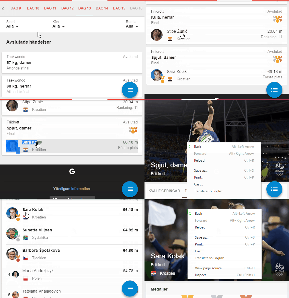
Last month there were the olympics, and Google made a nice widget in their search so it was easy so look up athletes and medals per country. During this period sometimes athletes make unexpected results and that was the case for some from my country. I used to do a google search for “Croatia olympics” to see the latest results. I wanted to look up some of the athletes from the widget in google search and learn more about them. How I usually do this, is select a text, right click and select search with google.
But it this case the whole thing was a button, even though it was also a text. It was imposible to select a text and to a right click or even copy the text to clipboard.

When it comes to web elements that should act on mouse click, the main ones are the button and the anchor element. Not the whole area behind the text with the text included. Especialy not with the right click. I hate when I lose my context and then have to go back to where I was just because of someone reinventing the button.
Twitter Search
This was on my rant todo list for a while. It’s about moving content after something is loaded on your page. I use twitter as an example, but there are so many cases of this terribe UX.
When I search for someone and I know their name will show up first, I type first letters with my left hand, and use my right hand to point the mouse to the first place where I expect the result. Except the result position changes if I’m not fast enough, and I click on a random thing that shows up there even though I never asked for it.

Keep your “smart suggestions” content elsewhere it you really need to show it. And stop moving content around. This is much more annoying when an ad shows up where I wanted to click on a link, and I end up clicking on the ad instead.
Google Chrome Backspace Removal
Web browsers should keep a promise of supporting the web that is, was and will be created. That goes with all surrounding experience in the browser. Navigation is very important, and the web is designed that you can navigate to new sites, but you always have to be able to go back.
I’m used to going back using backspace, and Chrome team invented new way of going back. Right Alt + Left Arrow. Try pressing that with one hand. Try it and feel the pain on the innovation. You can’t use the right Alt because that would rotate your screen in Windows.

Then they released an extension that fixes this, arguing that this is how it should be handeled - through an extension. Even though they removed the Chromecast extension and built it in the browser. These teams need to hang out together somethimes.
But this just goes well with the fact that google search hijacks your keyboard input and pressing backspace would delete the last letter even though the search box is not in focus. This is for every browser, even the ones where you would expect to go back by pressing backspace.
Some articles on this feature:
- https://bugs.chromium.org/...
- http://mashable.com/...
- https://www.engadget.com/...
- http://arstechnica.com/...
To record gifs I use ScreenToGif